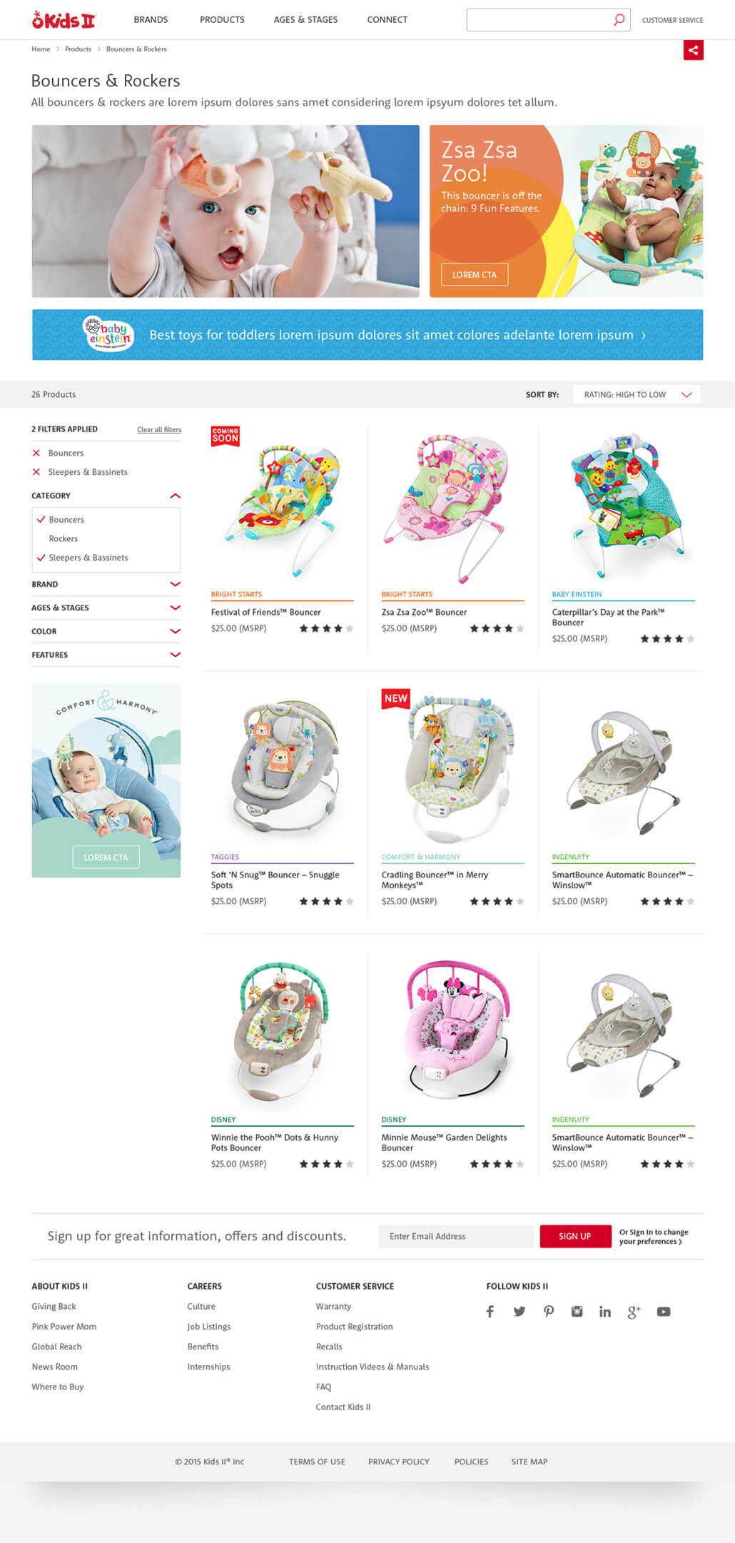
In 2015, Kids2 chose to combine each of their sub-brand sites into a single, responsive website. As a member of the Kids2 in-house team, I helped both to define the look and feel of the site and optimize major user interactions.

Out of many, one
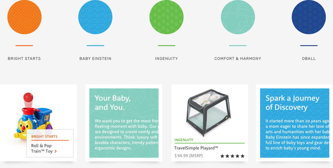
For the first time, all Kids2 brand properties were combined into a single site. To avoid logo over-use, I helped develop a system of brand patterns and colors to differentiate products and brand-specific content.

Built for business
At the time of launch, product sales were still occuring through 3rd party channels (Walmart, Amazon, etc). However, with future functionality in mind, the site was designed to facitate a full e-commerce experience, complete with product reviews and ratings.


Made for mobile
All aspects of the site were designed with mobile in mind. Navigation, product information, and feature content presentation where all optimized for a mobile-first generation of customers.
